Data Visualization Techniques: Turning Data Into Stories
The Data Visualization Techniques course is designed to help learners transform complex datasets into clear, engaging visuals that drive better decision‑making. In today’s data‑driven world, visualization is the bridge between raw numbers and actionable insights. This course equips you with the skills to design impactful charts, dashboards, and infographics using modern tools and best practices.
What You’ll Learn
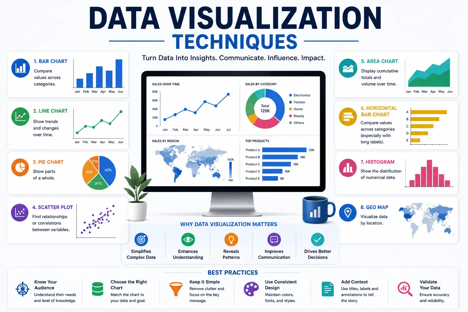
- Visualization Fundamentals: Understand principles of design, color theory, and storytelling with data.
- Chart Selection: Learn when to use bar charts, line graphs, scatter plots, heatmaps, and more.
- Dashboard Design: Build interactive dashboards that highlight KPIs and trends.
- Advanced Tools: Explore Power BI, Tableau, and Excel for professional visualization.
- Infographics: Present insights in visually appealing formats for reports and presentations.
- Storytelling With Data: Learn how to craft narratives that make data memorable and persuasive.
- Best Practices: Avoid common mistakes and ensure clarity, accuracy, and impact.
Why This Course Matters
Data visualization is more than aesthetics — it’s about communication. By mastering these techniques, you will:
- Simplify complex information for stakeholders.
- Enhance decision‑making with clear insights.
- Improve presentations and reports with professional visuals.
- Gain confidence in using industry‑leading visualization tools.
Career Opportunities
Completing this course opens doors to roles such as:
- Data Visualization Specialist
- Business Intelligence Analyst
- Dashboard Designer
- Reporting Consultant
- Data Storyteller
FAQ SECTION
What is a Data Visualization Techniques Course?
A Data Visualization Techniques Course teaches learners how to present data using charts, graphs, dashboards, and visual storytelling methods to communicate insights effectively.
Who should take this course?
Students, analysts, researchers, business professionals, and anyone working with data can benefit from this course.
Is prior data analysis experience required?
No. The course is designed for beginners and professionals alike.
Will I receive a certificate?
Yes. Participants receive certification after completing course assessments and projects.
What skills will I gain?
You will learn dashboard design, chart creation, visual analytics, reporting, and data storytelling techniques.
Why is data visualization important?
Data visualization makes complex information easier to understand, analyze, and communicate.
What tools are commonly used for data visualization?
Popular tools include Tableau, Power BI, Excel, Python visualization libraries, and business intelligence platforms.
Can data visualization improve business decisions?
Yes. Visual reports help stakeholders identify trends, patterns, and opportunities more efficiently.
Is this course useful for data analytics careers?
Absolutely. Data visualization is a critical skill for data analysts, business analysts, and reporting professionals.
How long does the course take?
Most learners complete the course within 6–8 weeks.


Reviews
There are no reviews yet.